DORMER House (2020-2023)
Addition/ Renovation, Nashville TN
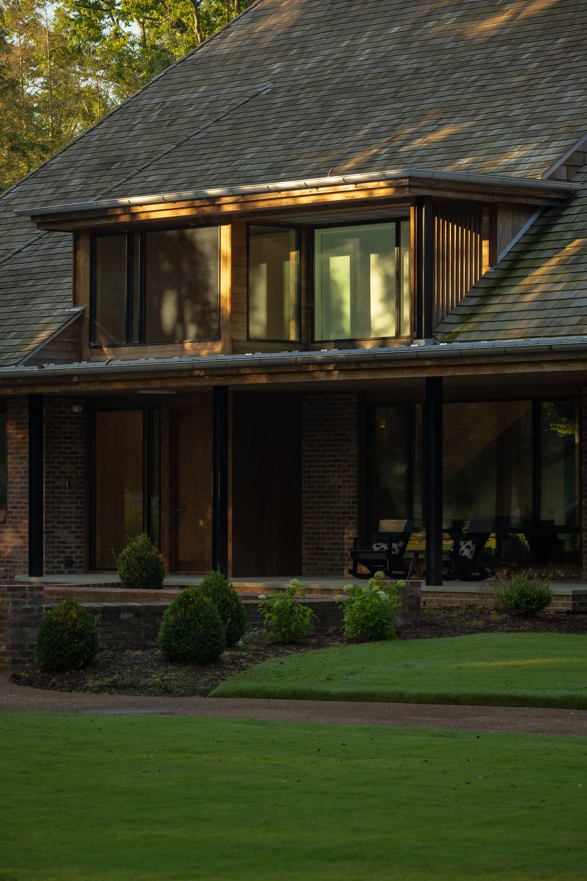
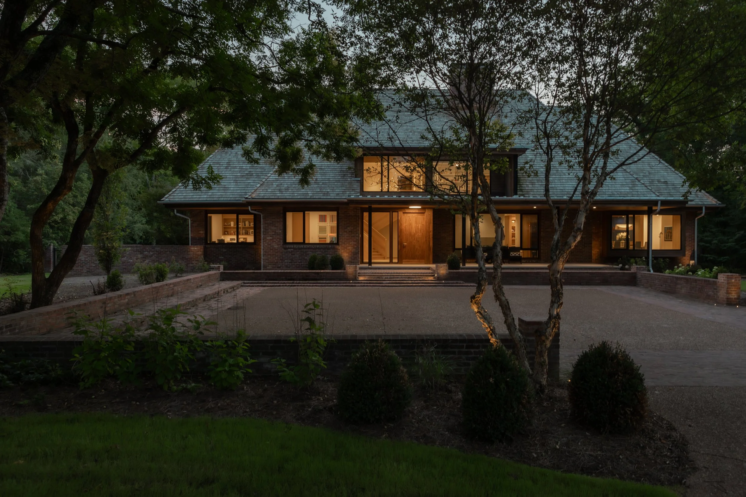
The existing outsized hipped roof was the project's protagonist. It was assertive in scale but clad in asphalt shingles and lacked proper flashing details. Only its excessive slope seemed to keep the water out. It had overly deep eaves, minimal fenestration, and dark uncomfortable interiors. Yet it did have a great profile, a handsome site presence, and a nice brick. All was not lost. Still, it came as no surprise to find the house was actually a house, inside a house, inside a house. The stone foundation pointed to a 100-year-old home, renovated in the 1950’s then renovated again in the 1980s when the hipped roof was added. Our goal: To make this house the best version of itself by addressing three primary issues:
The roof: We deployed six new dormers to give it rhythm and scale, provide for more interior space, and funnel light deep inside the home. Two more dormers were added to an unimproved attic space on the third level creating a new sixty-foot-long attic playroom.
Fenestration: We opened up the exterior brick facades with new windows, sliding doors, and window seats to create a stronger connection between the interior and exterior. The owners could now enjoy the comings and goings of the front yard while watching the kids play in the rear yard. The new windows also provided a stronger connection to the renovated pool and terrace reclad with crab orchard stone quarried 45 minutes down the road.
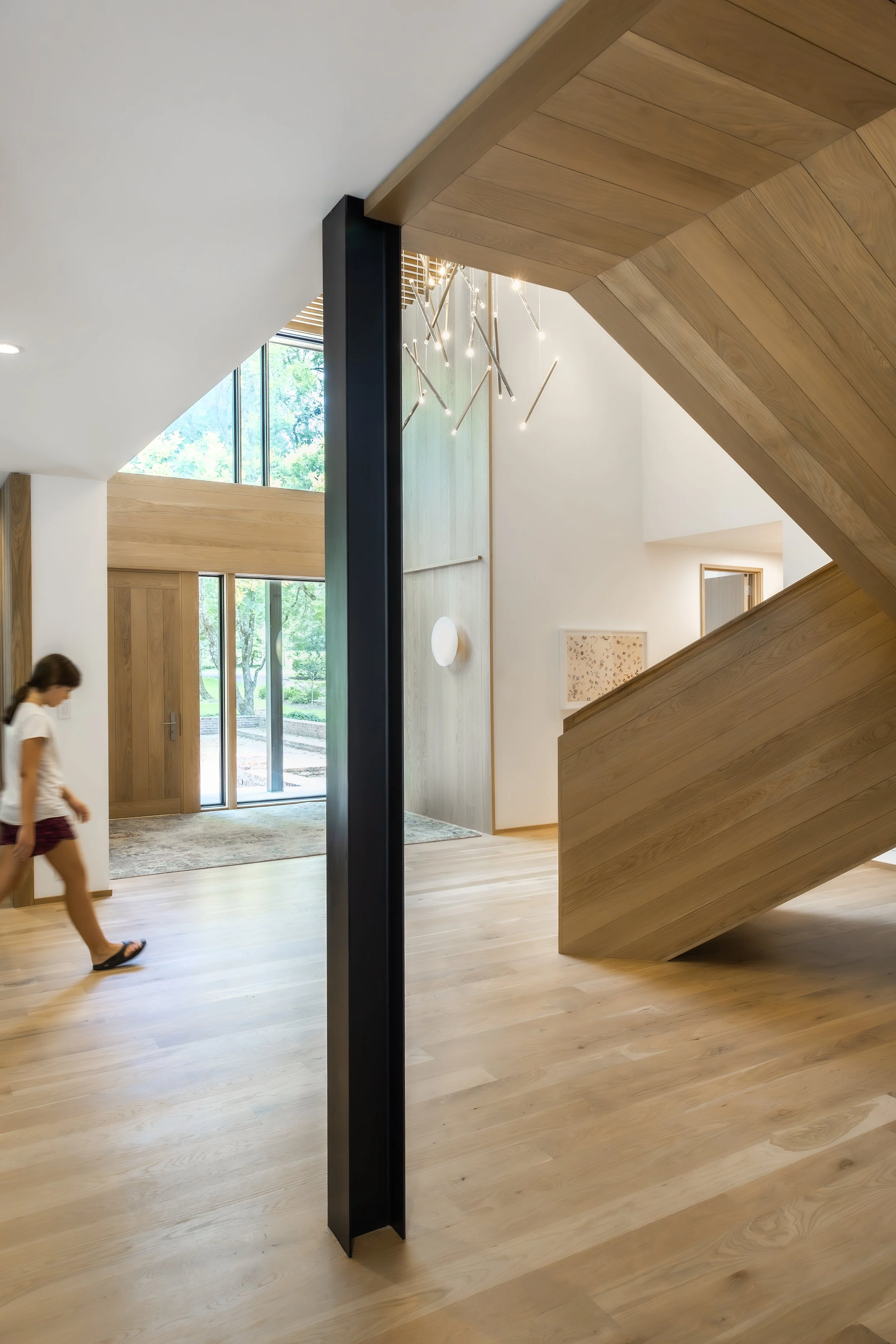
Interior organization: A flowing, open, interior space was carved out of the existing plan and underbelly of the roof volume above. This proved to be no simple task as most existing walls in the home were load-bearing as a result of previous renovations. A new home was framed inside the shell of the existing home. Hallways were removed, and circulation was achieved through a series of interlocking spaces. Steel posts were painted black and defined ‘rooms’ within the now open plan. They act as figures punctuating interior space. Being magnetic, they also became pin-up opportunities for notes and holiday cards. A sculptural wood stair, visible from all public spaces, became the home's ‘belly button’. It displays the high level of craftsmanship employed throughout the project.
Through these deletions and insertions, the existing home was updated and refurbished, ready for its next thirty years of domesticity.
project Credits
Architecture: Michael Goorevich Architect, PLLC
General Contractor: Huseby Homes LLC, Craig Huseby
Structural Engineer: Ruth Alwes
Landscape Design: BFTLanddesign, Ed Tessier
Interior Consultant: Dovetail Design Works, Katy Chudacoff and Michael Page
Cabinetry and Trim Work: Just Plane Wood, Roger Gramm
Photography: Anthony Matula - MA2LA [Brand Design + Photo + Film
AWARDS
2023 AIA Middle Tennessee Design Award - Honor Award
2024 Master Design Awards: Qualified Remodeler: Two Awards: The Staircase won a Gold Award, The Project won an Honorable Mention Award


